Cleveland, OH
15:55 UTC
Back to top
Web Design | Web Development | Branding
Revitalizing a music school's website and brand to showcase the school's unique offerings
Project Brief
A complete website redesign and build including a much-needed events app built with Glide Apps.
Roles
I assumed the following roles designing this website:
User Experience (UX) Designer
Interaction (IxD) Designer
User Interface (UI) Designer
Visual Designer
Deliverables
UX/UI Design:
Competitive Analysis
User Interviews
User Journey Mapping
Affinity Map
Site Map & Wireframes
Branding
Glide Events App
Framer for Prototyping & Development
Interaction Design
Project Specifications
Tools:
Figma
Framer
Glide
Octopus
Photoshop
Illustrator
Duration: 8 weeks
My Challenges
with the current site:
01
Large existing site not functioning well for its users
02
Not attractive or user-friendly therefore not reflecting the amazing work of the teachers at this school
03
Much of the content on the site required knowledge of the subject area making it intimidating to new potential families
My Objectives
for the new site design:
01
Design a fully responsive website for the music school which portrays their program offerings
02
Maximize the effectiveness of the school's web presence for current families and potential new families
03
Make the site attractive, accessible, approachable, and easy to maintain
Gaining empathy through research
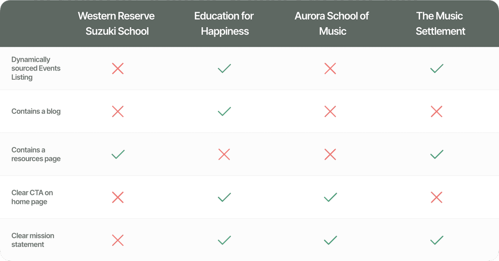
Competitive Analysis
I started my research with competitive analysis of other similarly sized music schools. Doing this helped me understand the approaches other school's took to their websites. Although many had a lot of information, I was surprised that these schools in general — despite the wonderful things they are doing — did not have better digital presences.
User Journey Maps
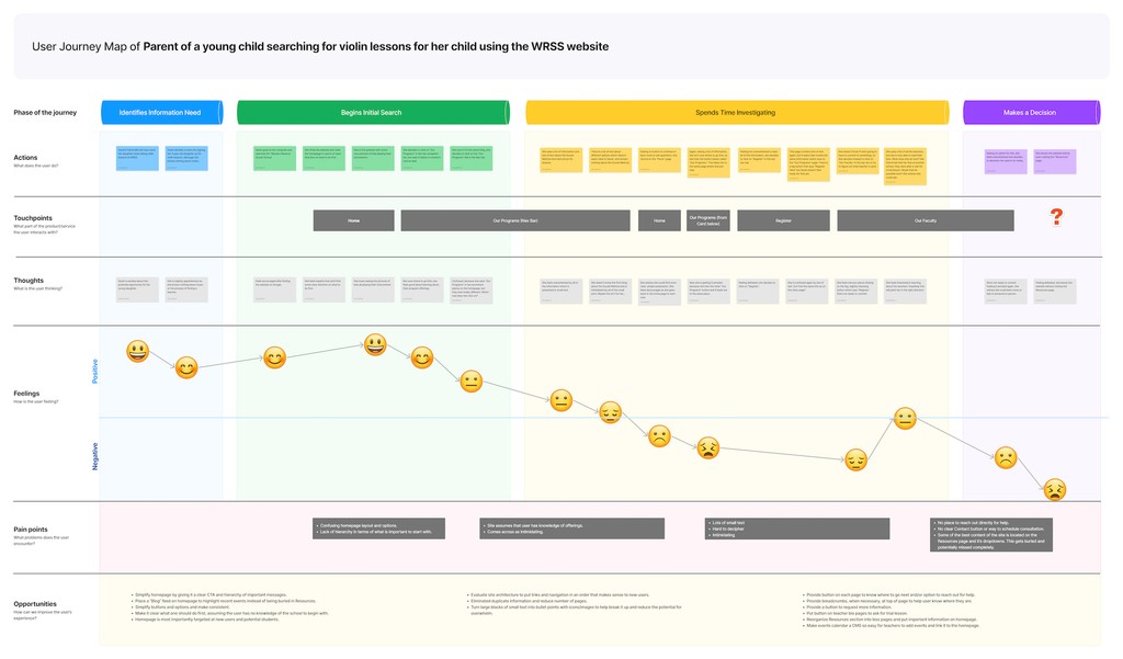
Using the Old Site
Doing this User Journey Map really helped me identify the frustrations that users might be having with the site the way it was. This is a user journey depicted based on the old site…ending in frustration.
User Journey Maps
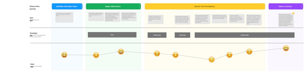
Using the New Site
Doing this User Journey Map really helped me identify the frustrations that users might be having with the site the way it was. This is a user journey depicted based on the new site I was imagining…ending in excitement & user action.
Affinity Map
Identifying Important Features by Synthesizing my Research
Perhaps the most important part of my research is synthesizing all of the information from my interviews, surveys and competitive analysis.
In order to convert these new users into WRSS patrons, it is crucial to understand their users and to cater the site and its mood to them.
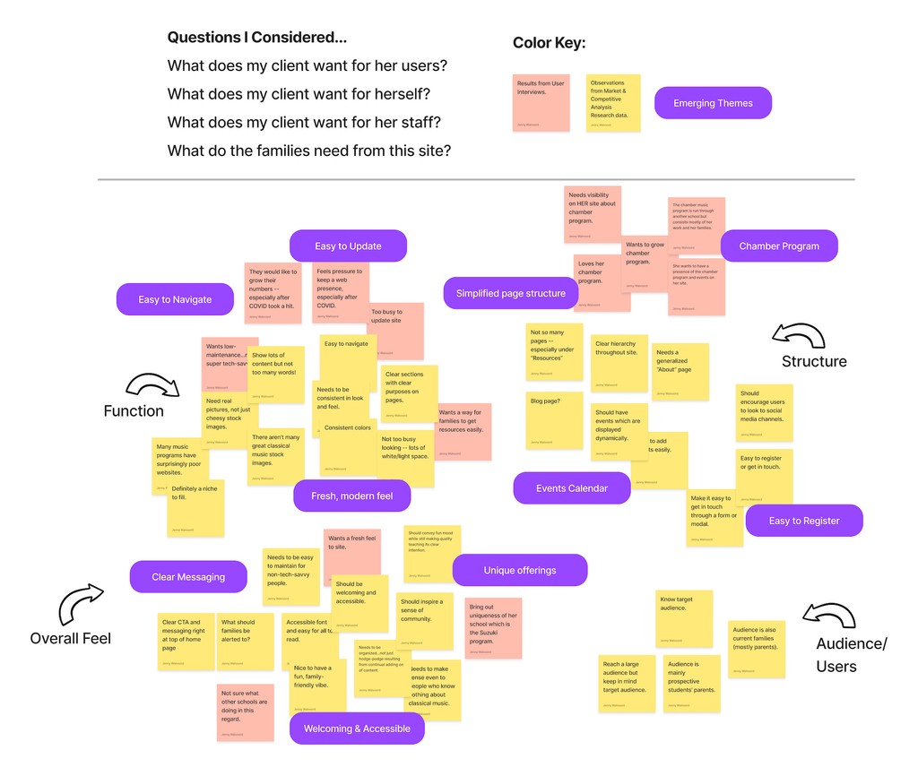
Through my research, three main areas of focus emerged:
Branding | Decluttering | Clarifying Function
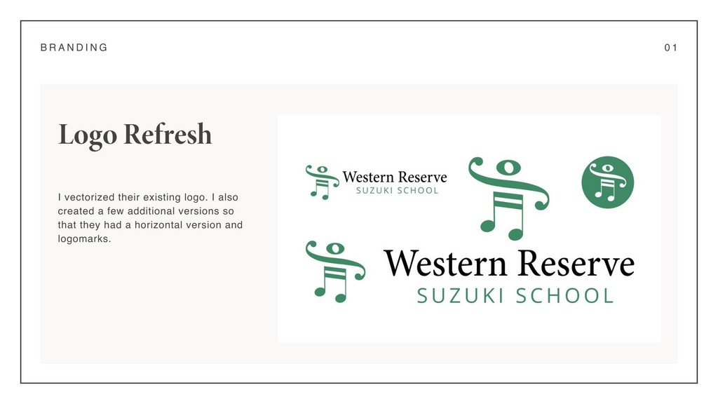
Branding Overhaul
Site Organization & Simplification
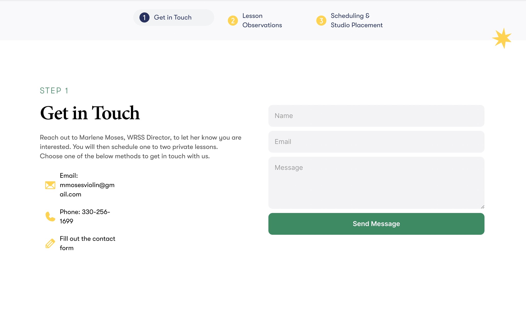
Site mapping & Wireframing
I started with an initial draft of a site map that I thought addressed many of the school's initial complaints.
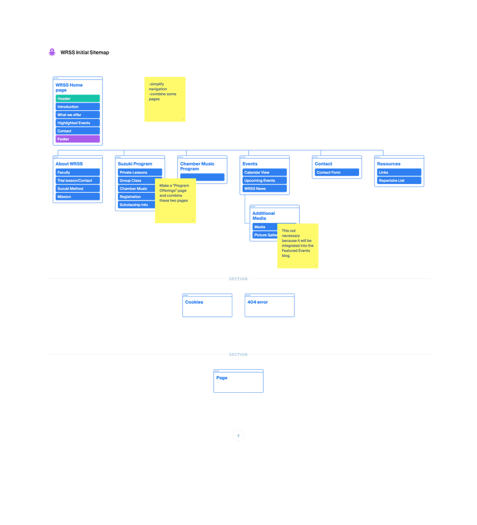
However, after some back-and-forth and discussion, I decided that it would be beneficial to simplify the site navigation even more.
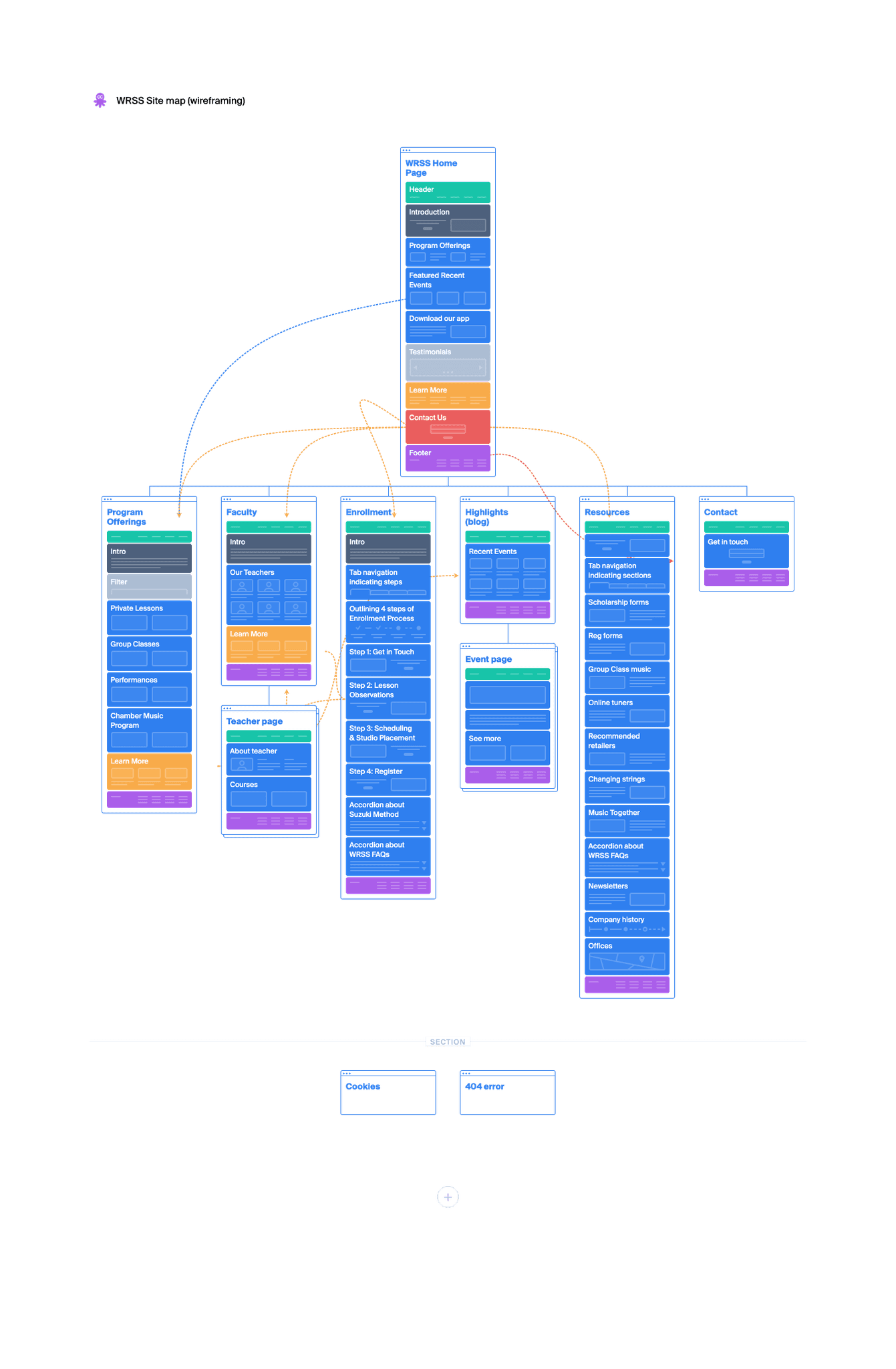
This site map, informed by surveys, interviews, and discussions with the school's directors, reflects our work on simplifying the site navigation. I was able to incorporate wireframing into this iteration in order for the school's directors to have a good sense of the functionality of the finished site.
Because of the relatively quick turn-around on this project, I felt that this low-fidelity wireframing could take the place of sketches.
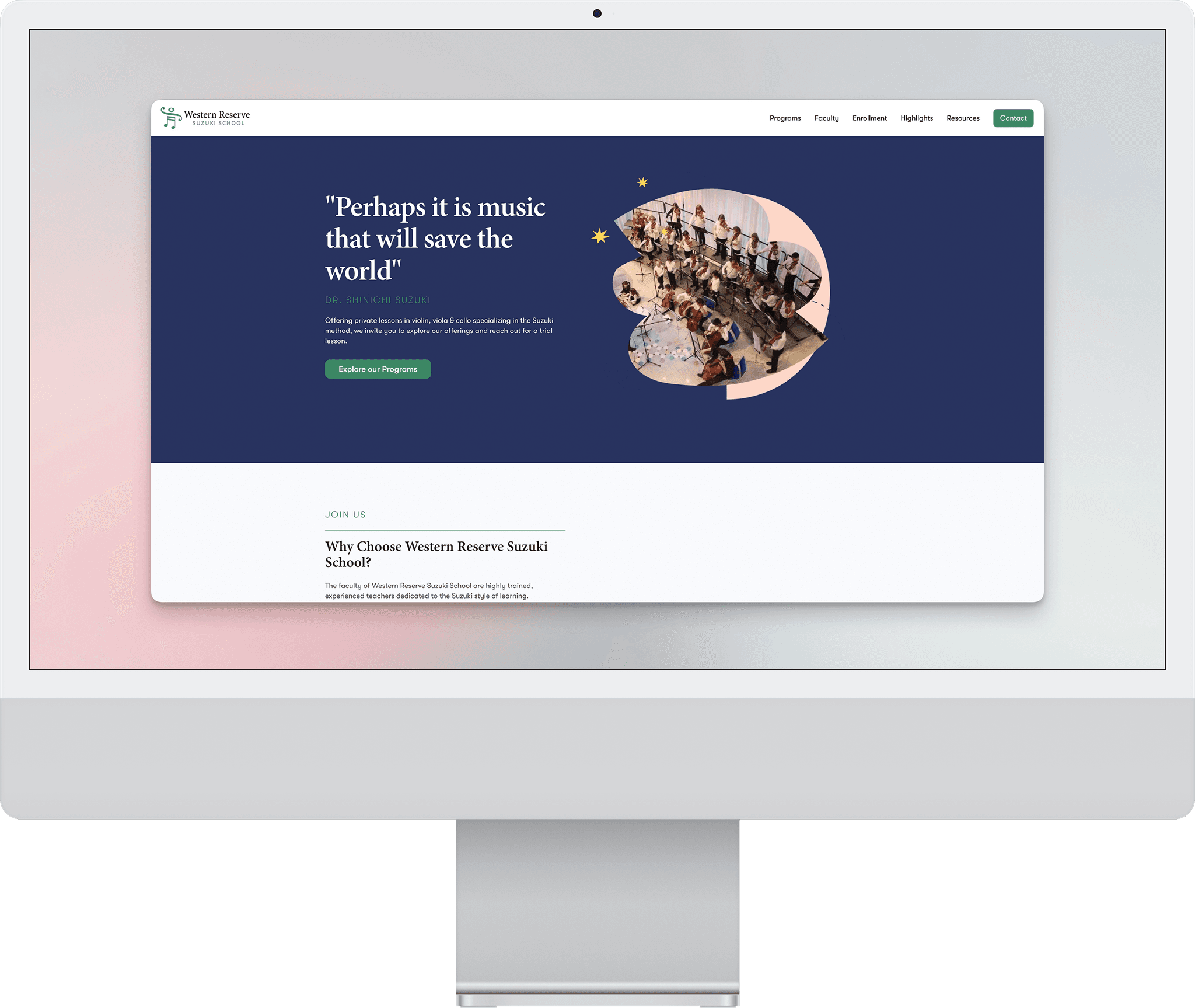
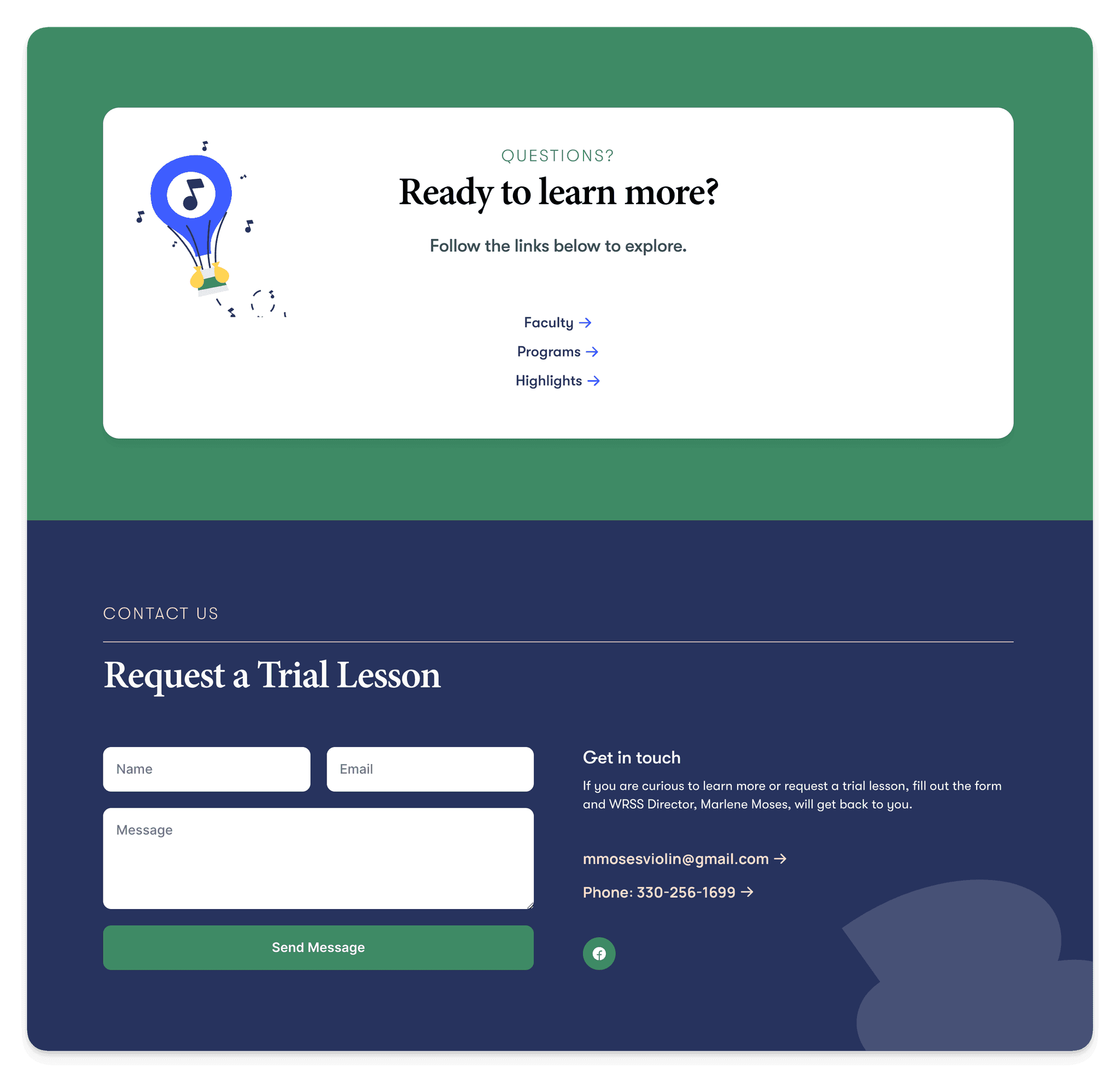
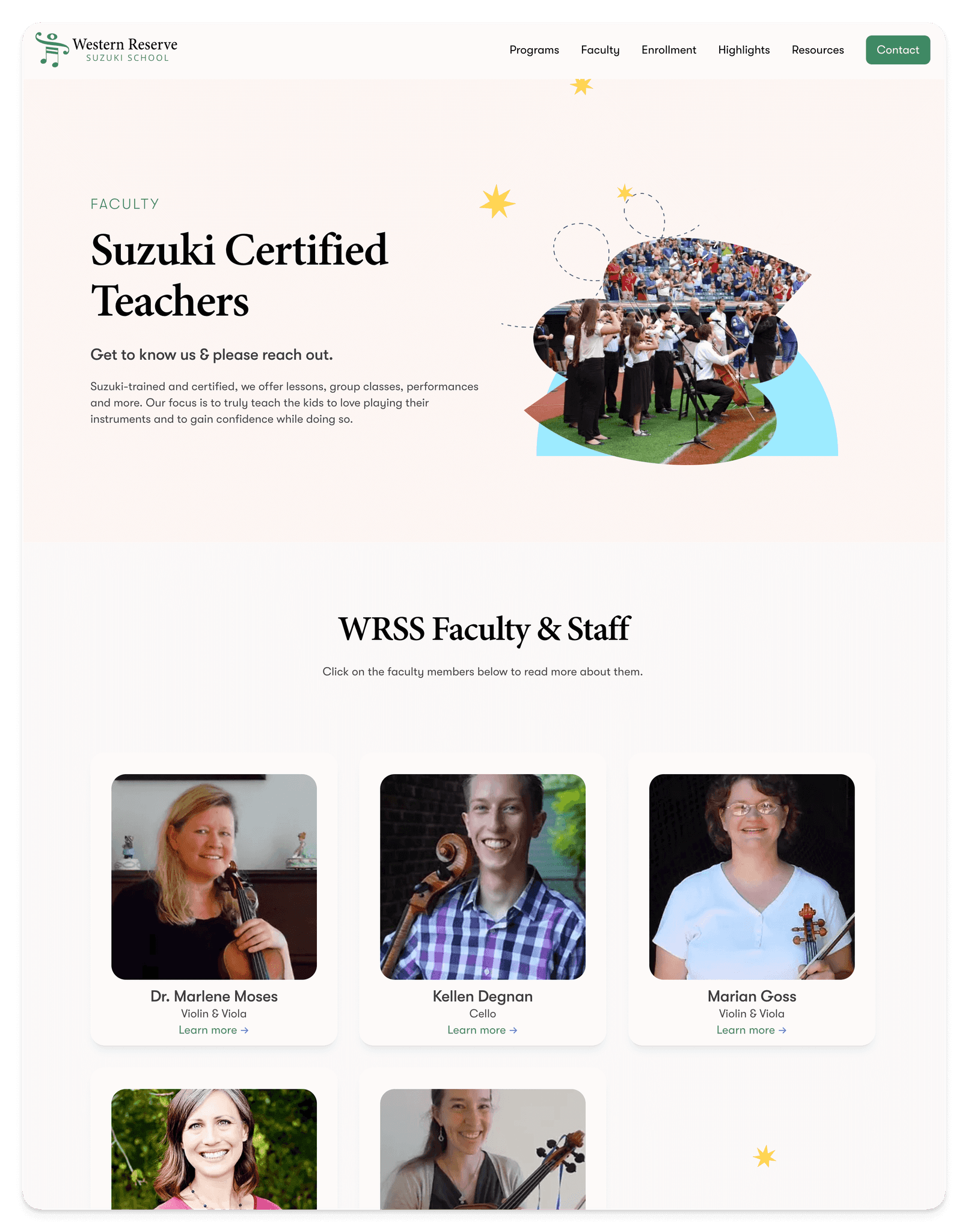
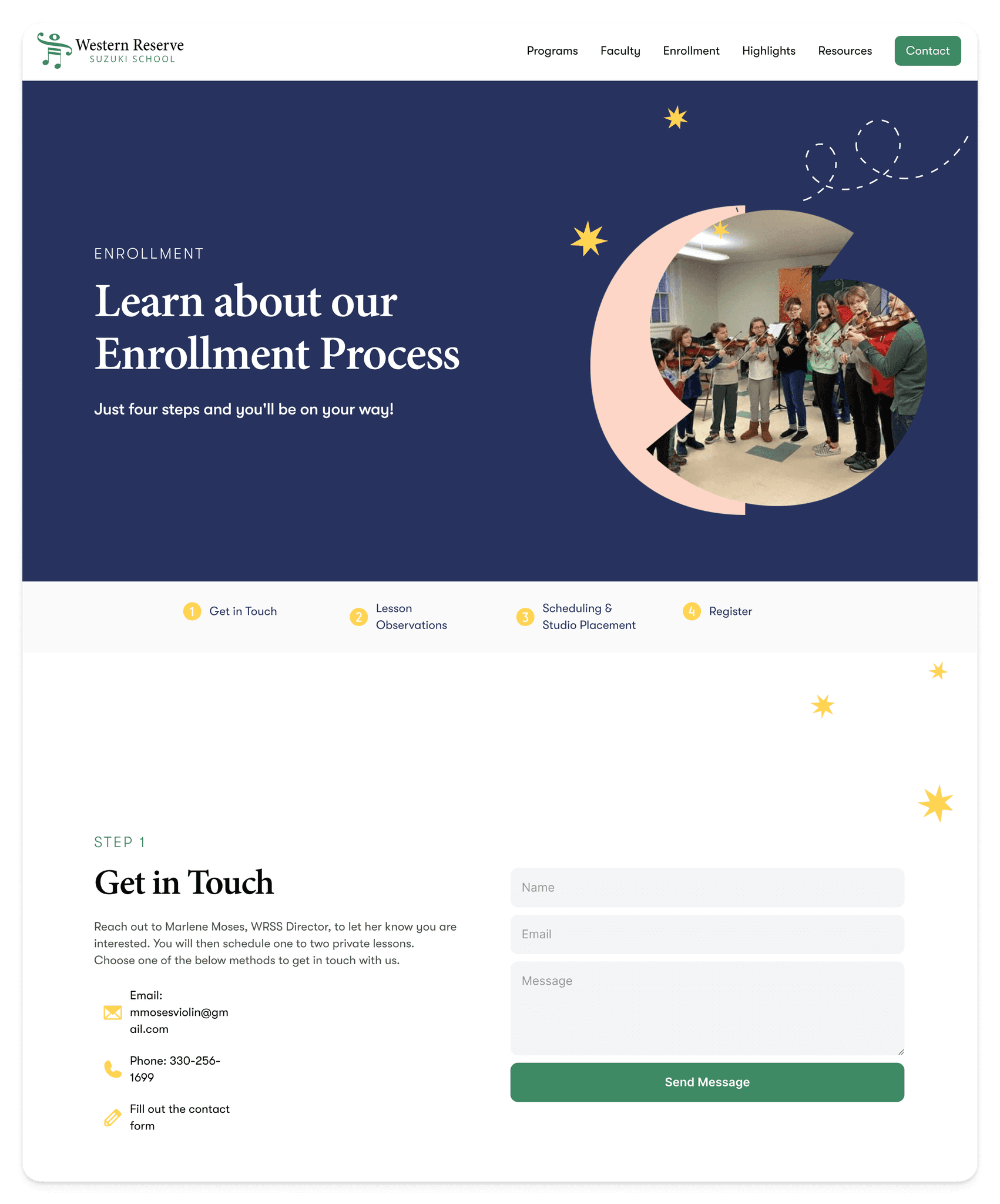
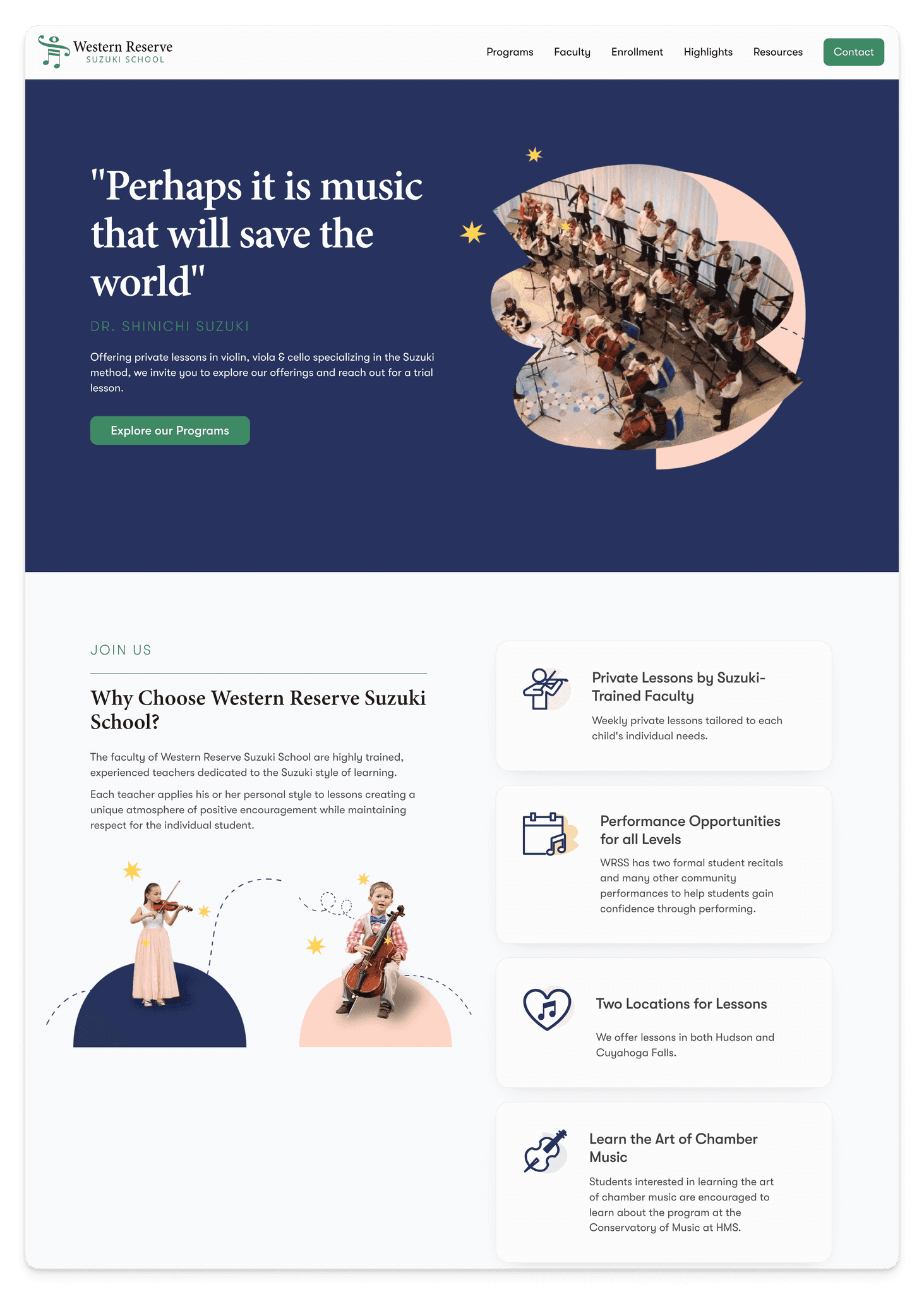
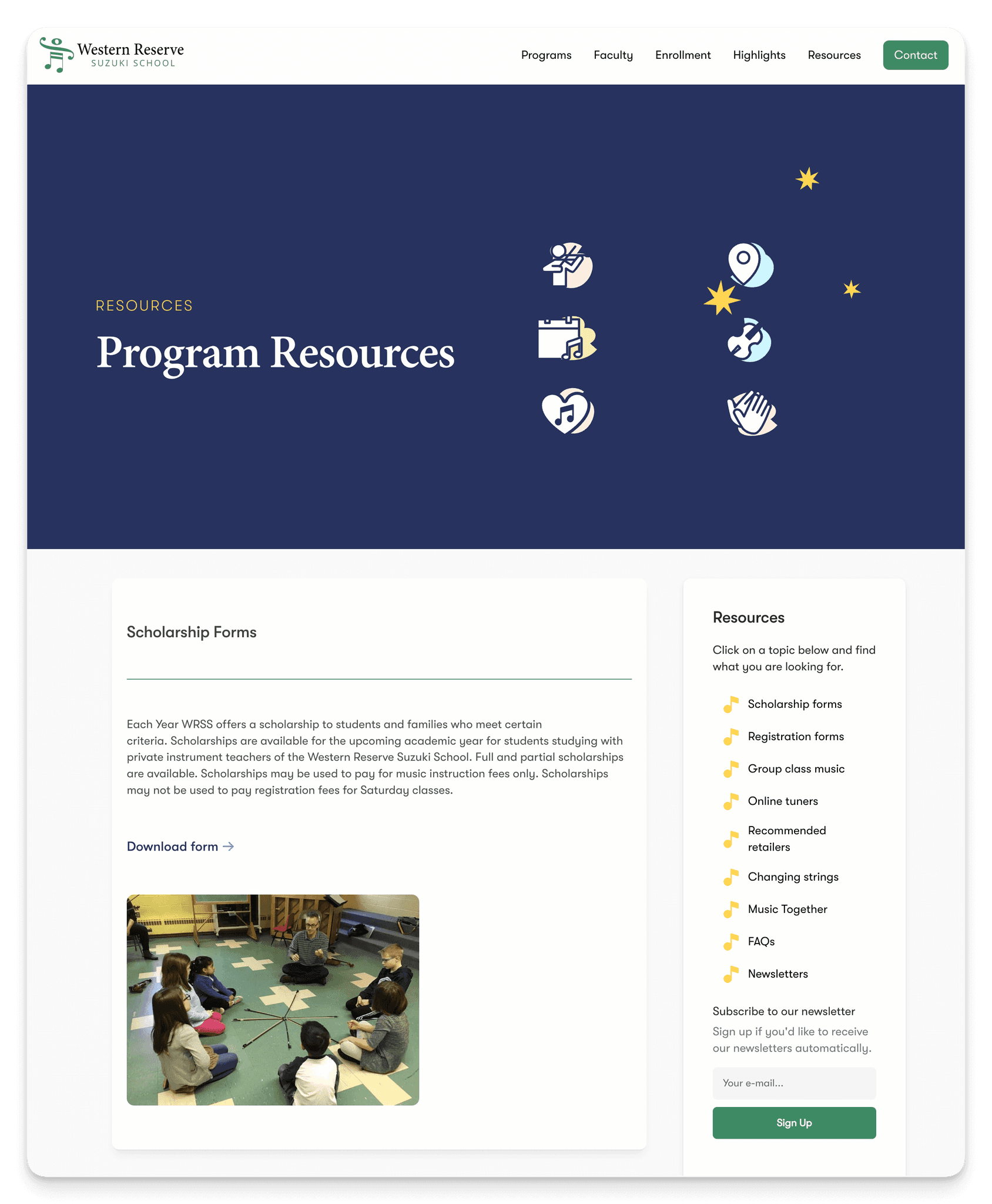
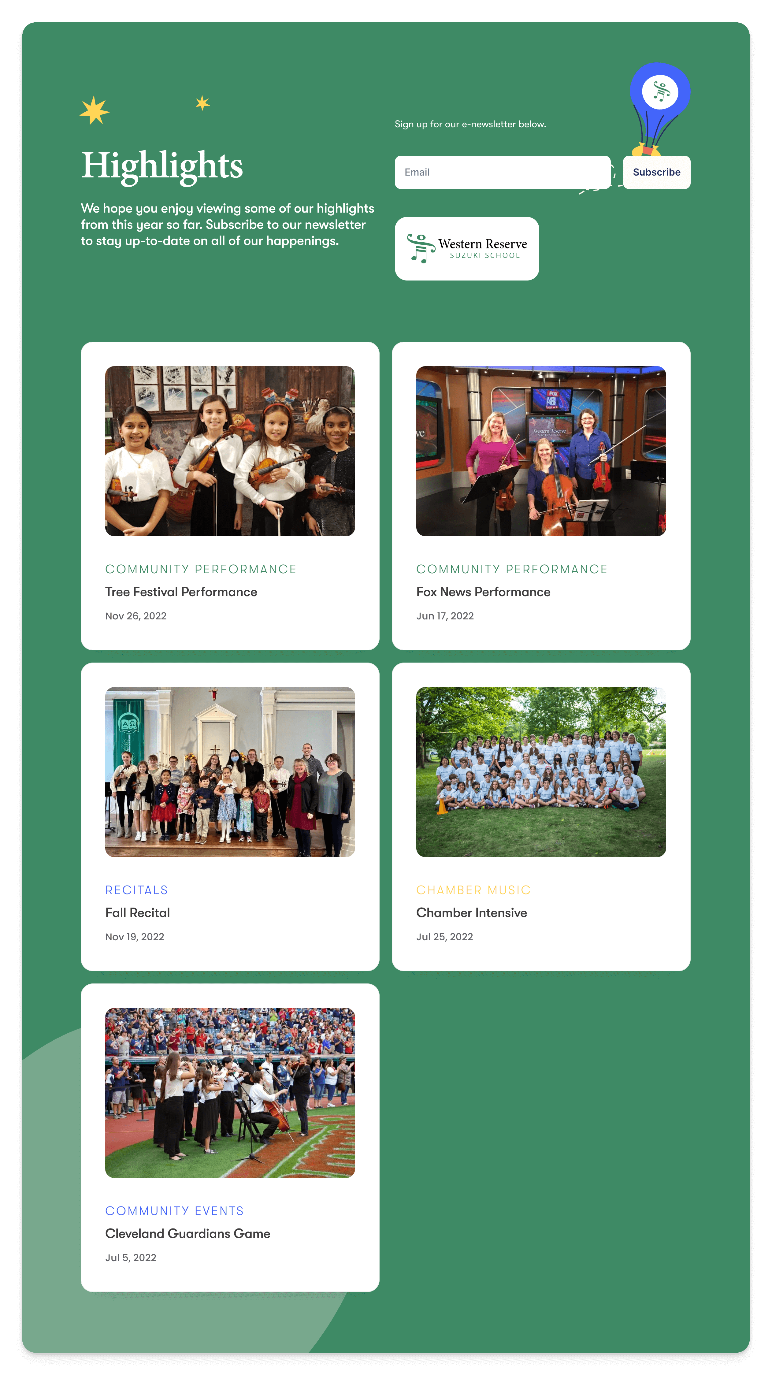
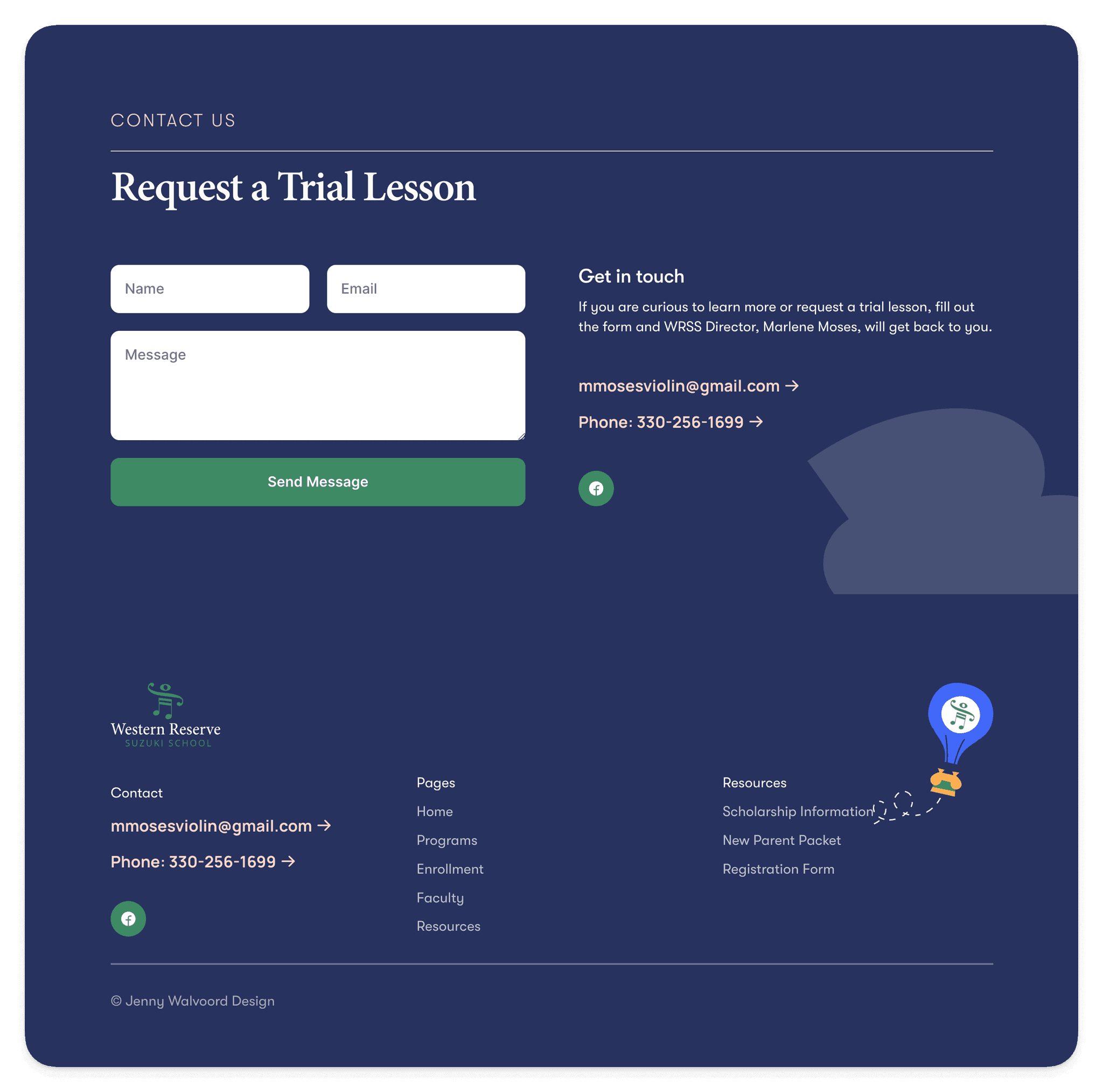
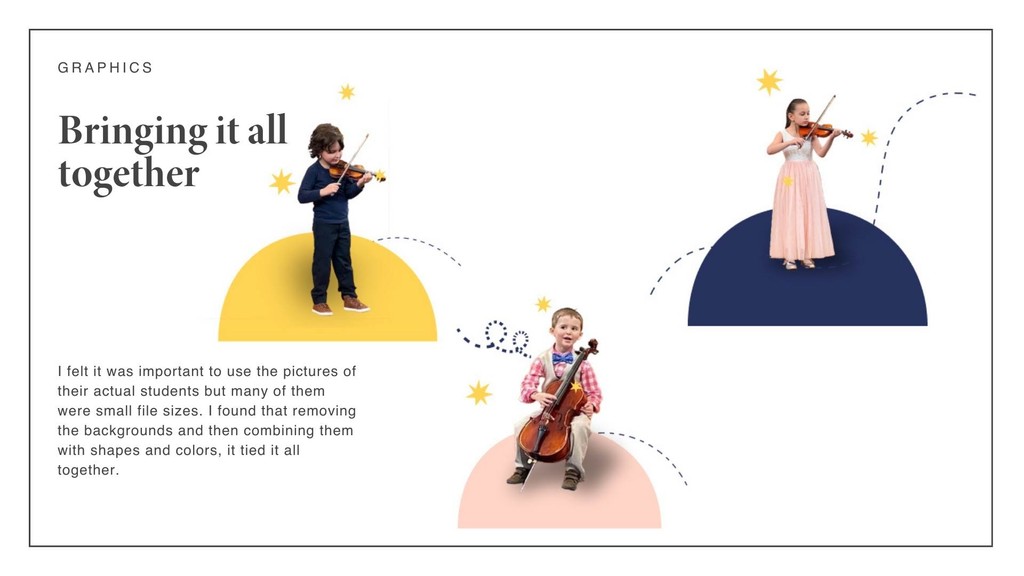
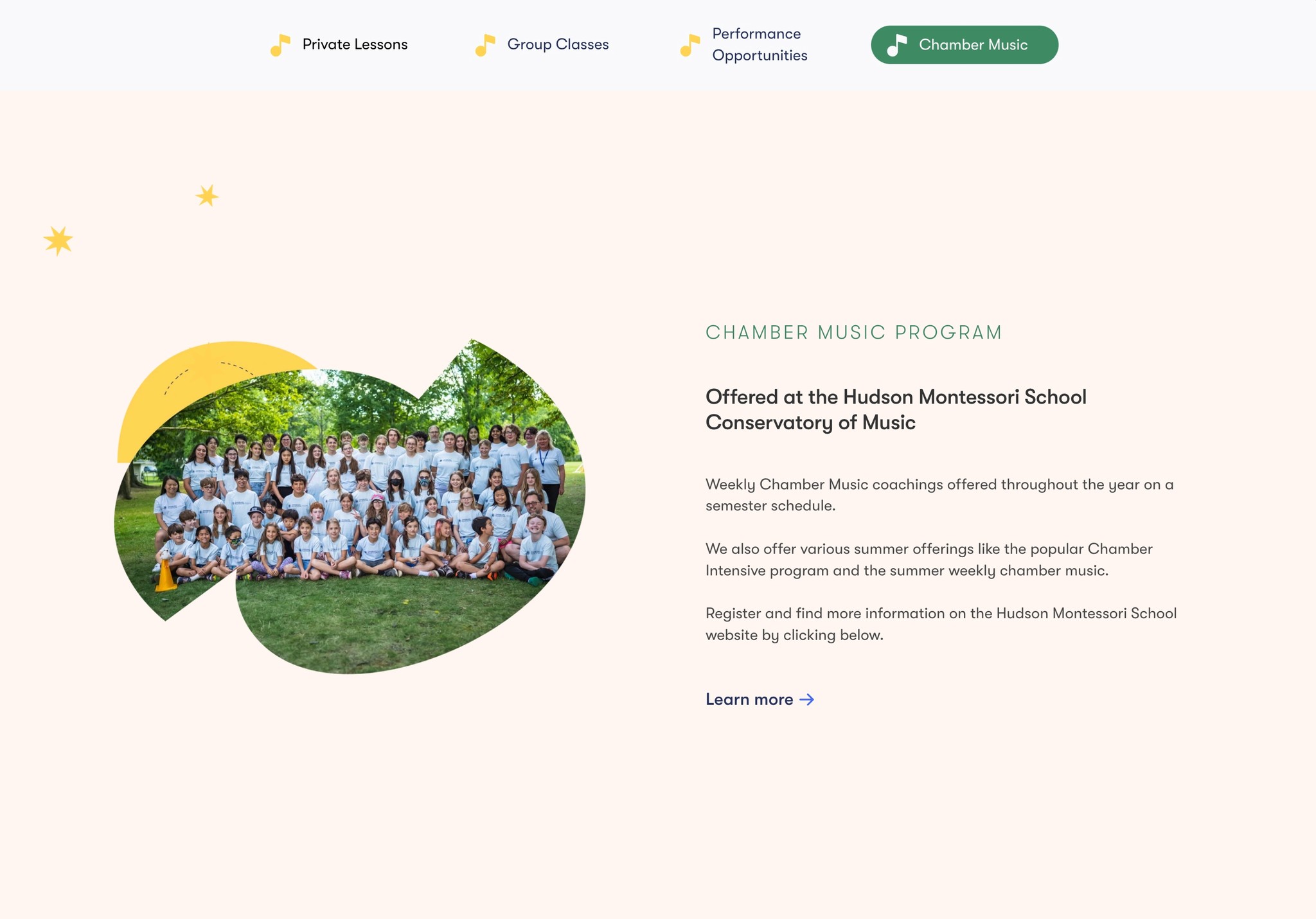
Visualizing a Consistent Look & Feel
Creating components in Framer
Below, you will find a side-by-side comparison of some areas of improvement. These improvements were made possible by developing reusable components in Framer thus giving the site a more organized, calm, and consistent look.


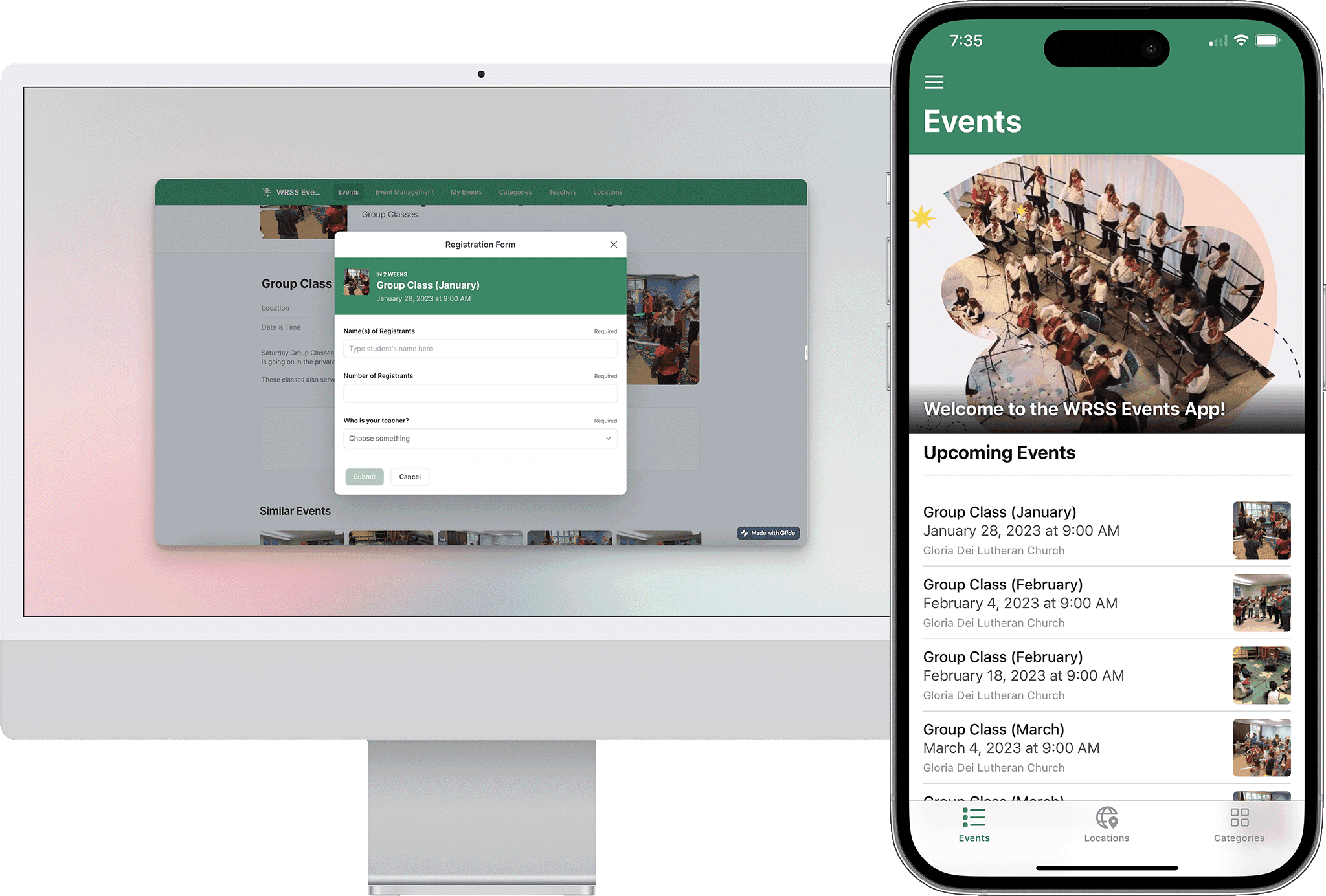
New, Simple Events App
Looking for a solution
I came to realize that a website alone might not achieve what this school is looking for. I began to research ways that they could highlight past events, market their offerings, and display information.
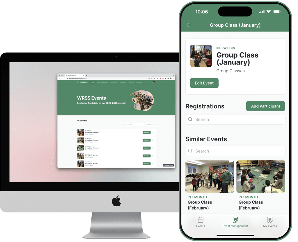


New discoveries
I envisioned a product that would allow families to communicate directly back to the faculty without having to use email.
I used Glide Apps along with Google Sheets to create an events application for the current families and students.
Meeting the needs
Easy for the teachers to add events:
The Glide app's data is connected to a Google sheet which the teachers are easily able to access and add events.
Each parent can download right to their personal devices.
This is a Progressive Web App meaning it is intended to work on any platform with a standards-compliant browser, including desktop and mobile devices. As the developer, and users will be able to add the application to their home screen
Easy for the parents to search and respond to events:
I set up a feature in Glide that allows the parent to respond/register for events.
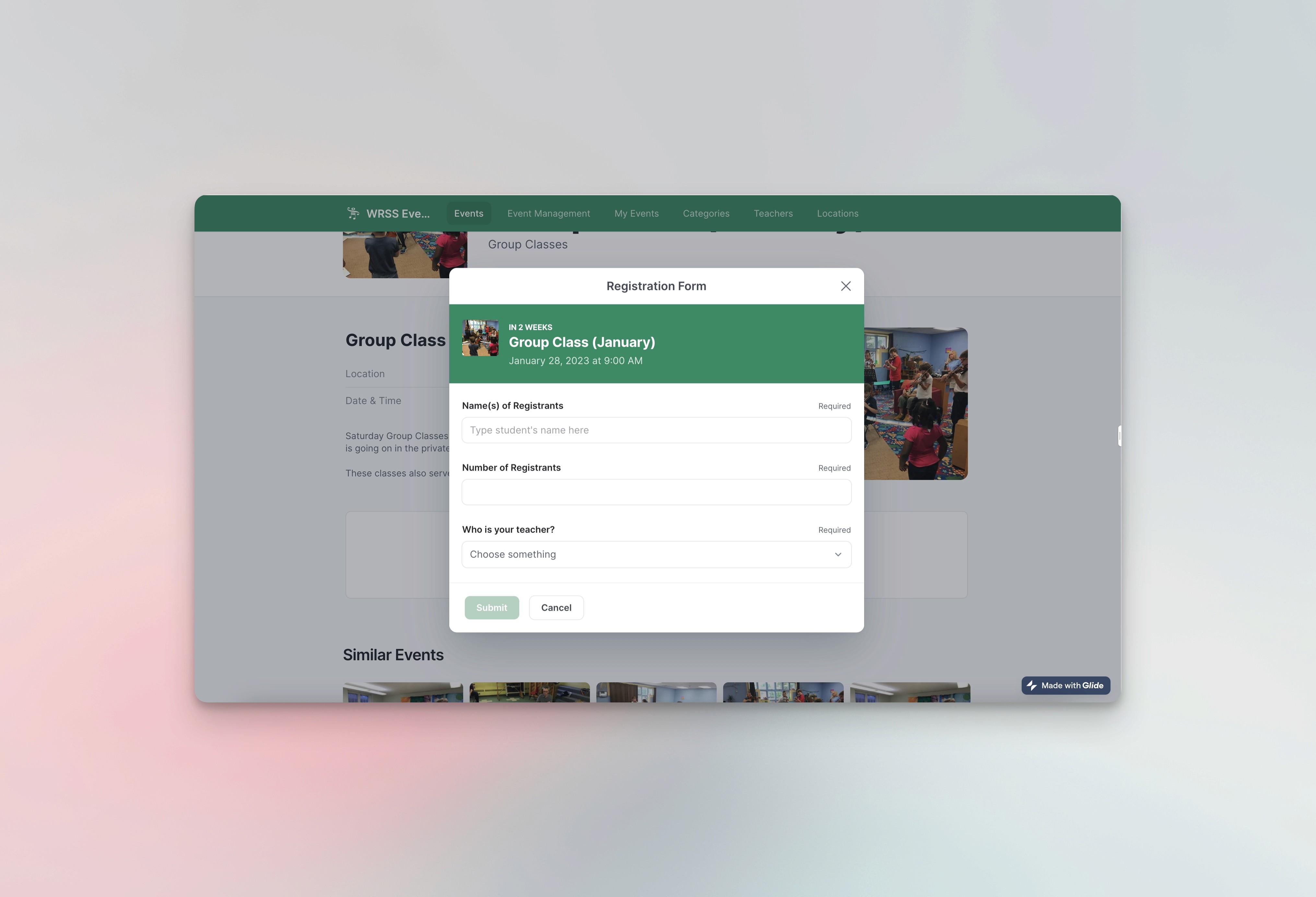
Search all events or filter by category
Teachers can be assigned special user roles therefore giving them the ability to add their own events directly from the app.
Families can register, edit the registration and see all of their events in their profiles
Next steps:
Feedback | Iteration | Improvements
I am in close contact with the directors of the school and we continue to tweak the new site. They are thrilled with it so far!
They love the organization of the content and the fact that the events piece is now separated from the website...therefore decluttering the website.
I plan to continue learning and building more Progressive Web Apps in Glide and other low-code tools.
Perhaps my biggest takeaway in this project is the realization of how important communication is when dealing with clients. Being in close contact and really listening are the most important factors in determining a successful outcome of a project.