The Brief
Redesign and rebuild an existing website for a large music school in North East Ohio.
The Process
Project Background
A complete website redesign and build including a much-needed events app built with Glide Apps.
The Western Reserve Suzuki School is a non-profit organization in the Cleveland, OH area offering private lessons, group classes, and performance opportunities to young musicians aged 3 through high school. The faculty of Western Reserve Suzuki School are all highly trained, experienced teachers. Dedicated to the Suzuki Method of teaching, each teacher applies his or her personal style to lessons creating a unique learning atmosphere of positive encouragement while maintaining respect for the individual student.
As a musician, teacher and administrator myself, I have often wondered if our teaching websites could be better. Whether we work as a private studio owner, or part of a larger school, one's website is the window through which the public sees what we offer. Many music schools do not have usable, attractive and accessible websites because the teachers/musicians are too busy doing what they love...inspiring their students!
I worked closely with the director of the school, I led the design process for the research, redesign and rebuild of their website in order to fully and accurately portray their program offerings and maximize the effectiveness of the school’s web presence. The final site was built in Framer.
Challenges
My challenges in going into this project were that I had a large existing site that wasn't functioning as well as it could for its users. One of the main functions of the site is to attract new families to this music program. However, the program is unique, and therefore many new visitors to the site may not understand the "lingo" and therefore may be intimidated or overwhelmed with what greeted them on the current site.
I decided that I needed to design a website that was attractive and functional to both new users unfamiliar with classical music education and existing users already in the program. Also, these existing users needed to be able to receive large amounts of information and resources, including important scheduling information and learning resources to download. Finally, I would need to design and develop a website that is easy for the teachers to manage amidst their busy schedules.
My objective was clear. I needed to design a fully responsive website for the music school which portrays their program offerings and maximizes the effectiveness of the school's web presence. I would need to make the site attractive, accessible, approachable, and easy to maintain.
Finding the Solution
Gaining empathy through research
Learning from (and about) my users
Using various research methods including User Interviews, Competitive Analysis, Archetypes & User Journey Mapping, I was able to empathize with the user’s needs, frustrations, and goals.
The approaches I took:
User Interviews
Competitive Analysis
User Journey Mapping
Synthesizing my research with an Affinity Map
Diving Deeper
Competitive Analysis
I was surprised when investigating many sites of similar institutions.
Why do these schools not have better websites?
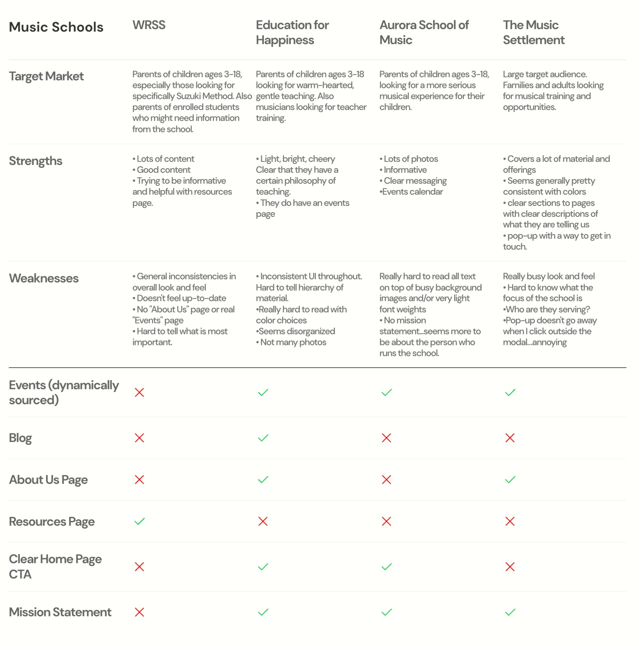
These schools are offering such amazing services to their students, but because of busy teacher and musician schedules, and limited technology budgets, many schools simply didn't have time to (or couldn't afford to) keep up good websites.
Gaining Clarity
Define
Based on my research findings, I was able to really understand and identify the unmet needs of users of the current site.
“Up until recently, we didn’t even have a website and we all know how important it is to have a web presence to attract new families to our program. But we are all so busy teaching that none of us have the time to keep it up-to-date. We get overwhelmed! I wish there was a way to have a website that is fresh and consistent looking and easy to keep updated.”
“After the pandemic hit, our enrollment really decreased. Now it is more important than ever to have a strong web presence in order to attract new families.”
“I’d really like the website to be easy for us to update. We are not really tech-savvy, but we have frequent events which will lead to the need for us to be able to update.”
How Might We Statements
How might we attract new families and increase enrollment in our program with a website that is attractive and easy for our families to navigate?
How might we have a strong and unique web presence that stays current and is easy for us to update without taking too much time away from our teaching?
Insights
Design an inviting, accessible homepage which is organized and has clear hierarchy of messaging
Simplified page structure and eliminate duplicate information
Outline the process registration/enrollment so less overwhelming for prospective parents
Provide an easy way for the faculty to add events and display school happenings
Meeting the Clients' Needs
Unexpected Needs Lead to New Discoveries
After digging deep into site architecture and organization, I realized something. Perhaps a website just isn't enough?
I came to realize that a website alone might not achieve what this school is looking for. I began to research ways that they could both highlight past events, market their offerings, and display information (website) and a product specifically for enrolled families strictly designed for getting upcoming event information out and also allowing parents to communicate back to the faculty.
I decided to build them an events app using Glide Apps.
I needed it to be:
Easy for the teachers to add events:
Easy for the parents to search and respond to events:
Everyone can download right to their personal devices.
In the end, the app ended up having lots of convenient features meant to make keeping track of the music easy and convenient!
Search all events or filter by category
Easy access from your own mobile device
Teachers can easily add events…either their own performances or WRSS community performances
Families can register, edit the registration and see all of their events in their profiles
See the full app here.
Branding
Brand Refresh
Highlighting the school's welcoming personality
I felt the need to lighten the overall look and feel of the branding.
Brightening up the color palette
I kept green as their primary brand color and used this color palette on the rest of the site. I wanted to highlight the fact that this is a school for kids, therefore keeping the mood playful.
Logo
I started by vectorizing the school's existing logo which was pixelated and low-resolution.
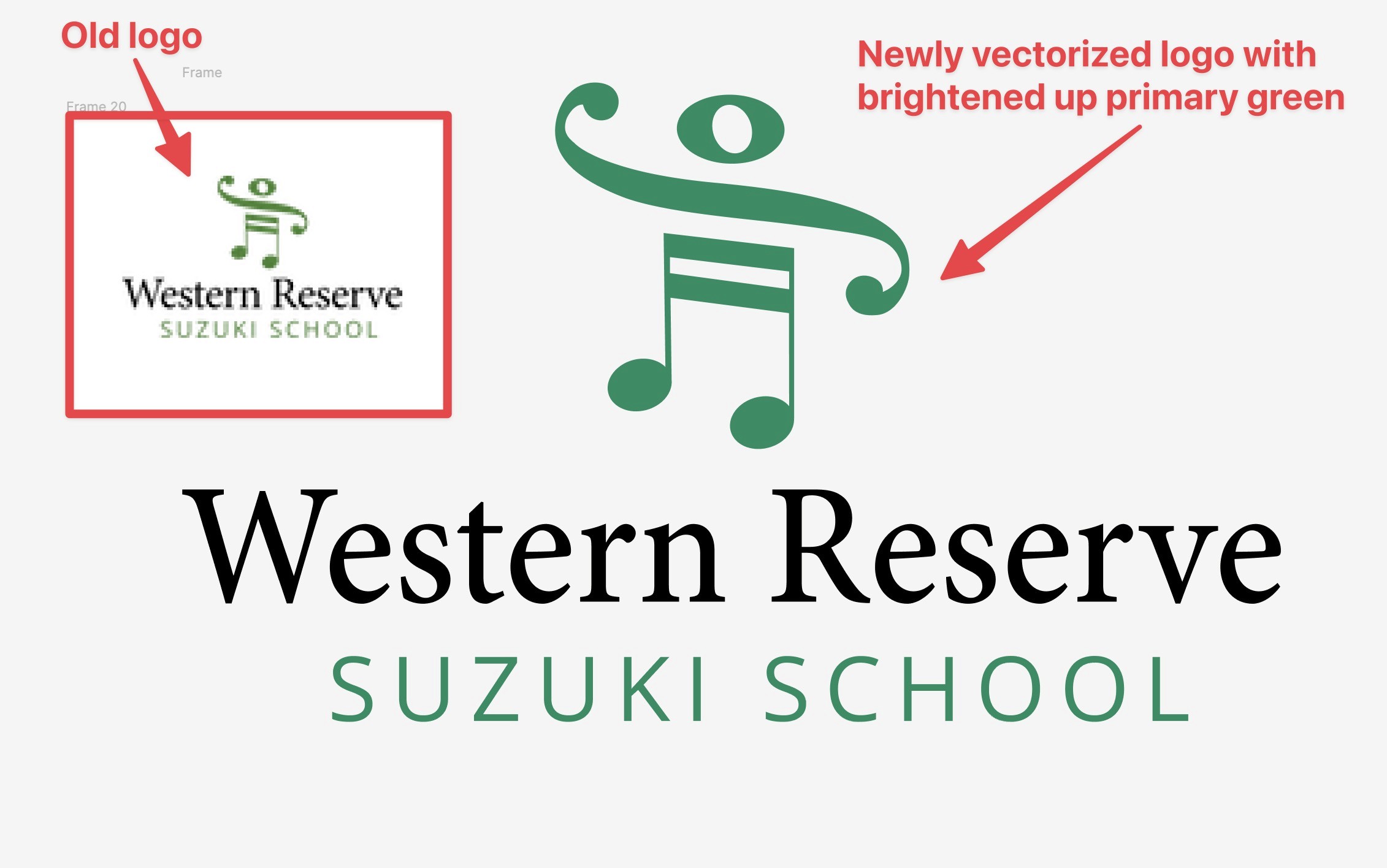
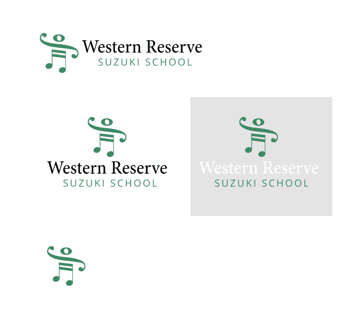
In addition to vectorizing their old logo, I created additional horizontal logos and a logomark.
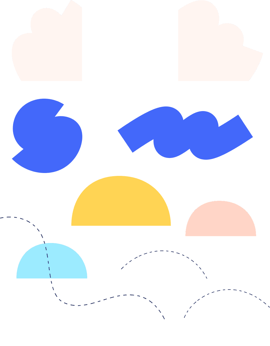
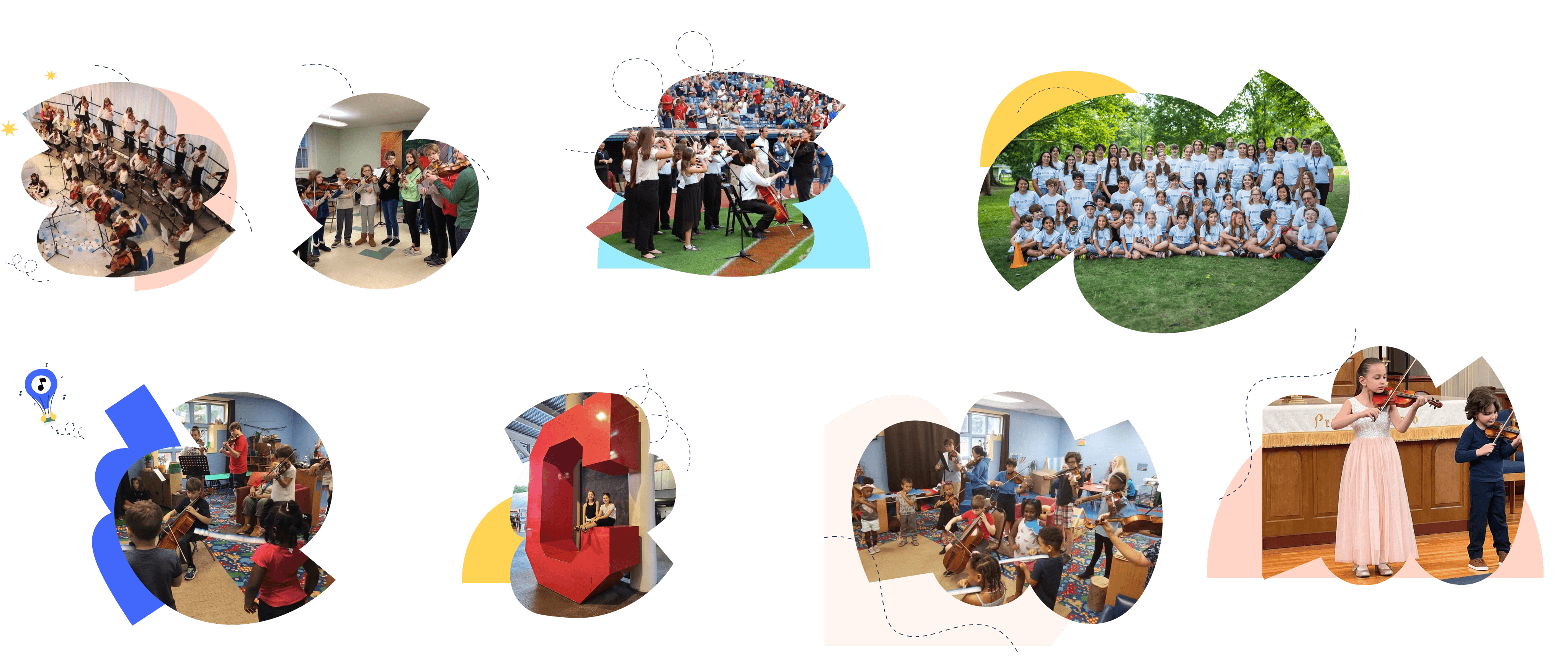
Utilizing Shapes & Colors
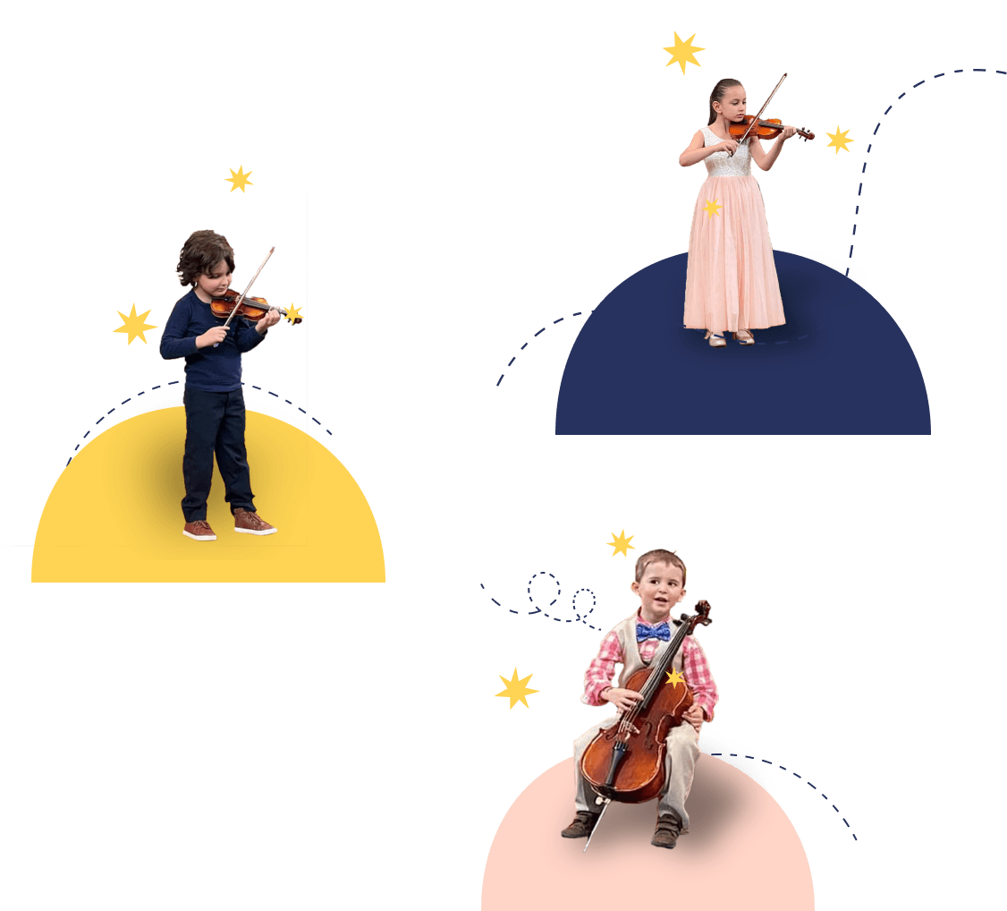
Highlighting existing pictures with shapes and bright colors
Custom Icon Set
I found it difficult to find music education icons, so I created a custom set for them.
Framer
Developing Framer Components
Thinking like a developer
Due to the fact that I not only designed this website, but I developed it in Framer, I had to think very much like a developer. I found that with so much content to display, I had to think creatively with reusable smart components.
Conclusions
Final Product(s)
Responsive Website & Events App
A Responsive Website
The final site was designed and built in Framer.
Easy to use, functional & welcoming. You are welcome to peruse the live site here.
An Events App
Made in Glide Apps
Borne out of necessity, this app will help the school's families stay on top of things.


